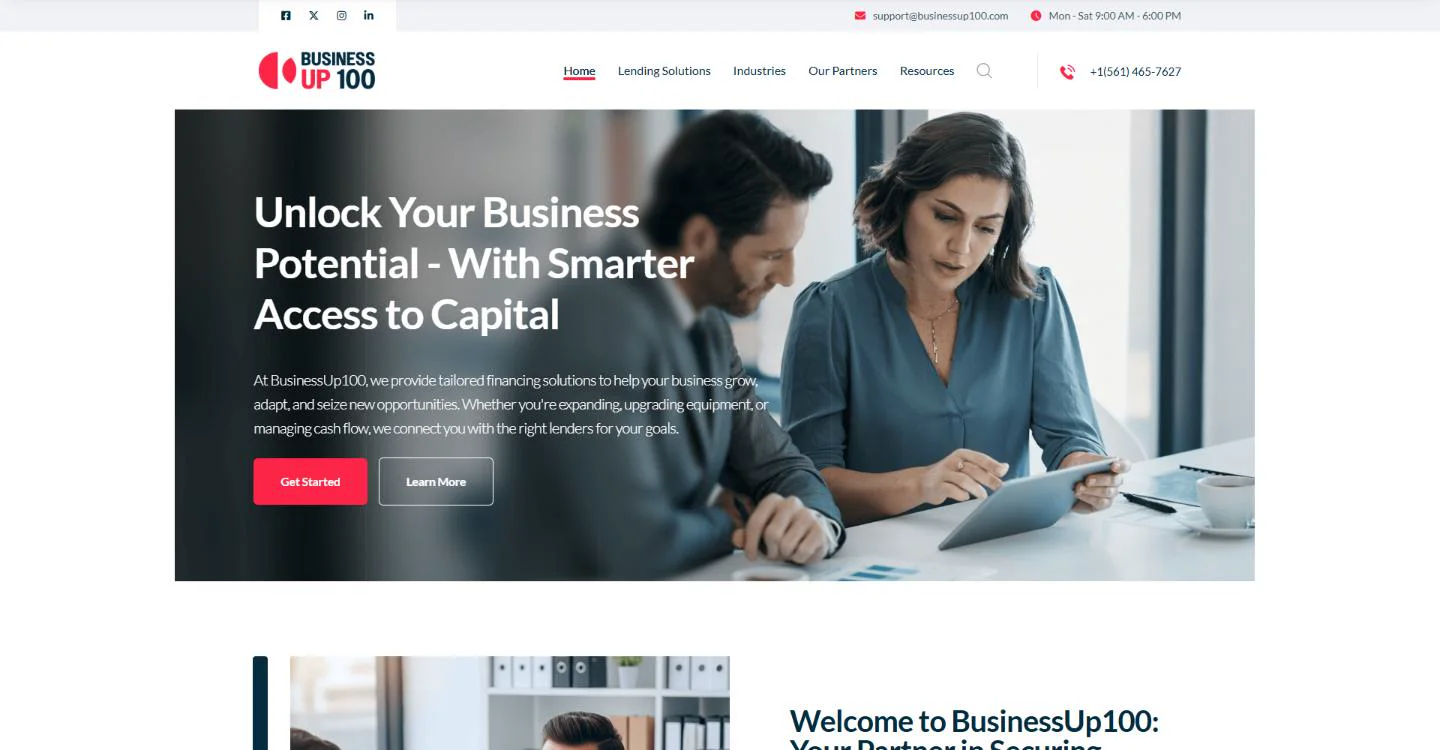
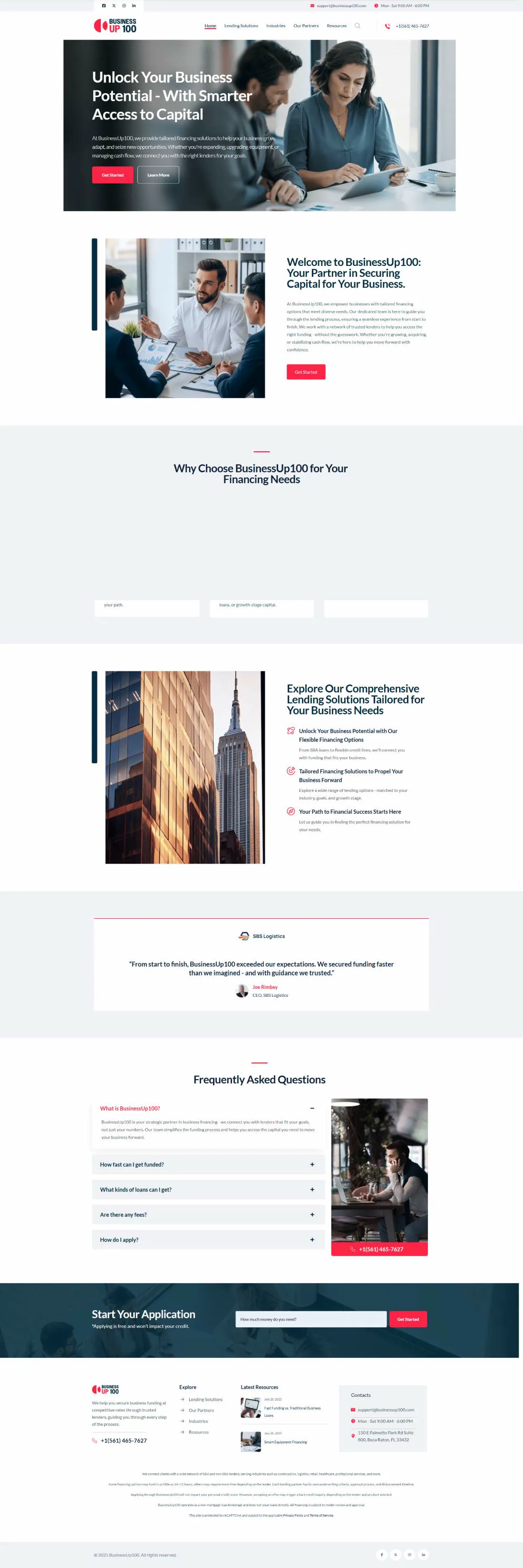
A Florida business-financing broker connecting owners to SBA and non-SBA lenders. The site sells a service nobody enjoys shopping for — so it removes friction rather than adding persuasion, and asks one question instead of a form.
Business owners looking for capital have been called by a dozen brokers already. The page has to look institutional in the first second — logo, phone number, hours, address — or nothing below it gets read.
Once trust holds, the ask is deliberately tiny: one field, "How much money do you need?", with the reassurance that applying is free and does not touch the credit score.
Red is spent only on buttons, section marks and the phone number — the three things a visitor is meant to act on. Navy holds the one full-bleed band; grey separates sections without rules.